How to Create Eye-Catching Covers that Stand Out in the TPT Search
Jul 02, 2024
Your Teachers Pay Teachers resource covers are typically the first thing that people see. You need to make it eye-catching and clear as to what your resource is. If your cover does not properly show off your resource, then a buyer is not likely to be interested and scroll past. This is exactly what you DON'T want to happen! So, let's get into some ways that you can make your Teachers Pay Teachers covers grab the attention of buyers.

1. Make all your Teachers Pay Teachers covers squares
When you upload your resource, TPT gives you the option to make your first page of the resource your cover. You definitely don't want to do this! Teachers Pay Teachers prioritizes covers that are square shape. Since most resources are 8.5in x 11in, TPT will try to fit that portrait or landscape page into a square. This will give you extra space around your cover that you don't want. Why only use 3/4 of the space when you could use all of it to show off your resource!?
Whether you are making your covers in Canva or PowerPoint, you want it to be a square that measures 1080px x 1080px or 8in x 8in. This will help to provide a more clear image when you upload your cover to Teachers Pay Teachers.
2. Have a big, bold and clear title
When people are in the TPT search, your resource cover will be the first thing that they see. You want to make sure they know exactly what they resource is. To do this, you want your title to be large and bold. You do not want to put in fluff words in your title. Keep it clear and straight to the point of what your resource is and what it covers. All the extra stuff is what your description and preview are for.
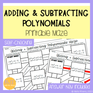
Your title should cover the upper 1/3 or 1/4 of the image. This placement and size is typically what the buyers eye is first drawn to when they see the resource cover in search. Many TPT sellers opt to have a plain colored box behind the title text to make it stand out more. Many also use bold, block fonts with contrasting colors (but still complementing to their brand colors) to help the title stand out more.
[caption id="attachment_6678" align="aligncenter" width="300"] This is an example of a printable TPT product cover.[/caption] [caption id="attachment_6679" align="aligncenter" width="300"]
![]()
This is an example of a digital TPT product cover.[/caption]
3. Limit clipart and other distractions
Remember that your Teachers Pay Teachers covers should showcase all the greatness of your resources. With that being said, you want to include photos of your resource in action. This means photos or screenshots of your resource partially completed, being completed, or fully complete. Be careful of including answers in your resource photos. Many students have been known to find the resource on TPT and look at the cover for the answers - kids these days...
The main elements of your covers should be the title, photos or screenshots of your resource and key words at the bottom. You can definitely use clipart, but you want to be care with overdoing it. Like the toilet paper commercial says, "less is more!" You only want to use clipart that is relevant and going to emphasize your resource cover. My favorite way to use it is to accent a layout. For example, with arrows or school supplies. Do whatever fits your style and brand!
A big thing that we want to remember when creating Teachers Pay Teachers covers is to keep it easy to read, show off your resource, and entice buyers to check it out. Use these tips I gave to help you create stunning covers that fill your style and brand. BONUS TIP: Don't forget to add your logo and your copyright (c) to each resource cover!
Do You Want a FREE List of Words & Phrases to Add to Your TPT Listings That Will Make Them Stand Out?
Join my email list and I'll send you my free Big List of Powerful Keywords and Phrases that teachers are ACTUALLY searching for. You can add these to titles, descriptions, thumbnails & more!
We hate SPAM & promise to never send it. Your contact information is safe and never shared.


